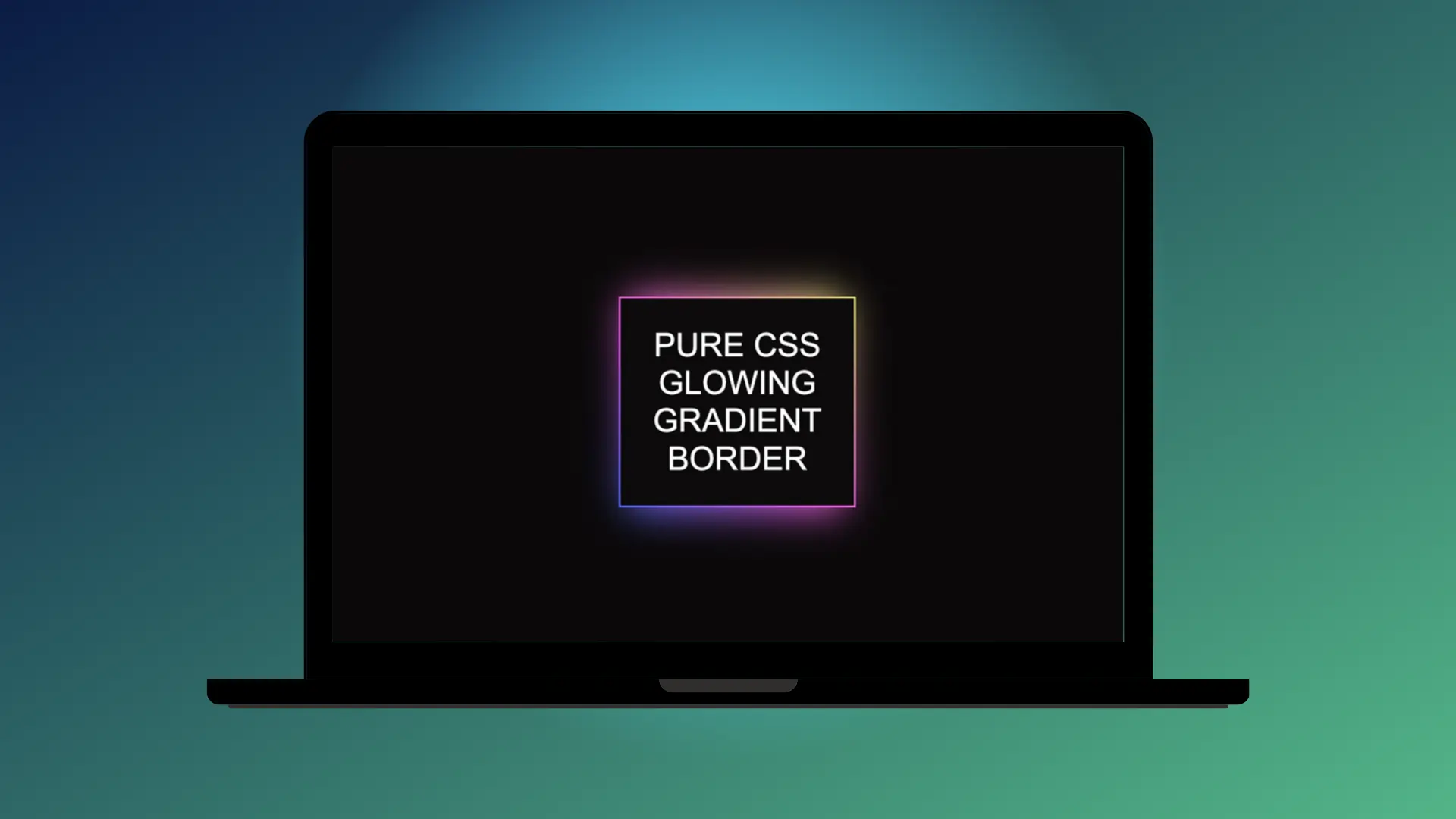
Learn how to create a glowing gradient border using pure CSS. Follow the steps below to achieve this sleek, vibrant effect for your designs.
Step 1: Add HTML
    <div class="container">
        <div class="gradient">PURE CSS GLOWING GRADIENT BORDER</div>
    </div>
Step 2: Add CSS
Set the colour and the position of the background and the elements:
    body {
        display: flex;
        align-items: center;
        justify-content: center;
        height: 100vh;
        background-color: #0b090a;
    }
Create the gradient border effect by using the :after or :before pseudo-classes (you can read more about CSS Pseudo-elements here):
    .container {
        max-width: 250px;
        padding: 2px;
        position: relative;
        z-index:1;
        background-color: #4158D0;
        background-image: linear-gradient(43deg, #4158D0 0%, #C850C0 46%, #FFCC70 100%);
        margin-right:25px;
        filter: brightness(120%);
      }

      .container:before {
        z-index:-1;
        position: absolute;
        content:"";
        width:230px;
        height:230px;
        left:10px;
        top:0;
        background-image: linear-gradient(43deg, #4158D0 0%, #C850C0 46%, #FFCC70 100%);
        filter: blur(20px);

      }

      .gradient {
        background-color: #0b090a;
        padding: 30px;
        color: white;
        font-size: 35px;
        font-family: arial;
        text-align: center;
      }
With just a few lines of CSS, you can add a glowing gradient border to your elements. Feel free to experiment with different colors and effects to make it your own!